I’ve just bought something from Amazon and something has happened that has happened to me every time I’ve used Amazon for the past few months. I’m not sure if it’s something they introduced recently or whether I’ve just not noticed it before but it’s bugged me one too many times so I’m going to moan about discuss it here.
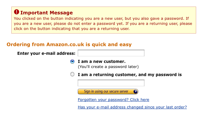
What happens is I add something to my basket, click proceed to checkout and then I am prompted with a log in screen. I enter my user name and password, but then I’m presented with the log in screen again. Something went wrong, I’m sure I used the right password, but lets try that again. Nope, back at the log in screen:

Now in my defense, the “important message” isn’t that obvious (to me anyway) in my default sized (wider) browser than it is in the screen shot. But lets take a look at it anyway:
“You clicked on the button indicating you are a new user…”
No I didn’t. Hell, until you pointed those out I really didn’t even notice them.
That’s right two bold pieces of text between two input boxes that I filled out and I missed them. Not once, but every time I’m presented with this page.
Now it may just be me, I’m sure Amazon do lots of usability testing, but surely it could be better by doing any of the following:
- Don’t show the password box until I select “I am a returning customer”.
- Make returning customer the default option, surely that is more than likely to be the case?
- Don’t title the submit button “sign in using our secure server” when that’s not what it’s doing (see 1).
- Don’t try to cram two functions into the same form.
Any of these will make the experience easier for the user, and also mean that there is less validation to be performed on submission of the form.
Now as a developer I know that things like this can sometimes happen. They get done, no-one really notices it or looks at it in any great detail from one month/year to the next. But still every time I use Amazon lately there is something that blocks my path consistently, which for some reason my brain doesn’t learn. I guess if I’m presented with a sign in page and two input boxes that my learned behavior of enter username, enter password kicks in and that’s why I don’t see the radio buttons between.