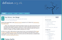
 Behold the beauty that is now DEfusion.org.uk, version 4 or 5 I think. As I mentioned a few weeks back:
…when I was releasing the JavaScript Image Cropper UI I really noticed how much this theme had begun to bug me, mostly for it’s lack of definition and space. It’s a tweaked version of a great WordPress theme, it has served me well, but I feel it’s time for a change. So I have created a design from scratch…
So here it is in all it’s glory and on a new server to boot, as since the launch of the Image Cropper UI and the resulting traffic the old server has been up and down like a yo-yo. Luckily plans were already in place for the new server and the build was completed late last week.
It took me slightly longer than I initially predicted to get from the mock-ups to the final full WordPress theme, mainly because I found they way wordpress themes are implemented a little ugly and not the nicest things to deal with initially.
Anyway it’s all in place now and I still like it, although I may have to tweak the comments presentation a little. Here’s a quick list of the major changes:
- Complete new design, giving more space & easier to read content
- Fluid layout, within reason
- Added ability to subscribe to comments
- Added robust code syntax highlighting for posts & comments
- Added ability to use textile for formatting comments
- Added pagination to comments, for posts with lots of comments this is a great benefit
- Utilised WordPress custom fields for code pages, this provides a consistent and cleaner look to my code project pages.
I hope you all like it.